
Mastering the S&P 500 200 DMA: How to Navigate Market Trends Effectively
Table of Contents
ToggleMastering the S&P 500’s 200-Day Moving Average: Your Compass for Long-Term Trends
Welcome, fellow market explorers, to a deep dive into one of the most revered and sometimes feared technical indicators in the arsenal of traders and investors: the 200-day moving average (200 DMA). For the S&P 500, this single line on a chart can act as a critical compass, guiding our understanding of the market’s long-term direction. Whether you’re just starting your investment journey or seeking to refine your technical analysis skills, understanding how the S&P 500 interacts with its 200 DMA is absolutely fundamental. It’s not just a number; it’s a proxy for the market’s collective long-term sentiment and momentum.
Think of the S&P 500’s price chart as a winding road, full of twists, turns, ups, and downs. The 200-day moving average, or 200 DMA, is like a smoothed-out version of that road, showing the average price over the last 200 trading days. Why 200 days? It’s a widely accepted period in technical analysis, often used to filter out the short-term market noise and reveal the underlying, longer-term trend. When the S&P 500’s price is consistently above this line, it suggests that, on average, prices have been increasing over the long haul – a potential sign of a bullish trend. Conversely, when the price is consistently below the 200 DMA, it indicates that, on average, prices have been falling over the long term – hinting at a potential bearish trend.
But the 200 DMA doesn’t operate in isolation. Technical analysis is about combining signals. We often look at the 200 DMA alongside shorter-term moving averages, such as the 50-day moving average (50 DMA), which tracks the intermediate trend. The relationship between these moving averages and the price itself can paint a much clearer picture of market health and potential turning points. As we navigate this topic together, we’ll unravel how these lines interact, what specific patterns signal, and how you can interpret these signals to inform your own trading and investment decisions.
The primary functions of the 200 DMA include:
- Acting as a long-term trend indicator.
- Filtering out short-term price fluctuations.
- Providing potential support or resistance levels for traders.
| Time Frame | Moving Average Type | Characteristics |
|---|---|---|
| Short-Term | 10 or 20 Day EMA | Responsive to recent price changes, indicates immediate trend directions. |
| Intermediate | 50 Day SMA | Balances short-term volatility, tracks medium-term trends. |
| Long-Term | 200 Day SMA/EMA | Indicates overall market momentum, less sensitive to short-term fluctuations. |
The Mechanics of Moving Averages: Smoothing the Path
Before we delve deeper into the S&P 500’s relationship with its 200 DMA, let’s ensure we have a solid understanding of what a moving average is and why we use them. At its core, a moving average is a simple calculation: it takes the average closing price of an asset over a specific number of periods (in this case, trading days) and plots that average as a single point on the chart. As each new trading day passes, the oldest data point is dropped, and the newest one is added, causing the average to “move” and adapt to the most recent price action. This continuous recalculation is why it’s called a *moving* average.
There are different types of moving averages, each with its own subtle nuances. The most common are the Simple Moving Average (SMA) and the Exponential Moving Average (EMA). A Simple Moving Average gives equal weight to each day’s price within the calculation period. It’s straightforward and effective at smoothing out volatility. An Exponential Moving Average, however, gives more weight to the most recent prices. This means an EMA will react more quickly to recent price changes than an SMA of the same period. For long-term analysis, like the 200 DMA, both SMA and EMA are widely used, though SMAs are often favored for their smoother representation of the overall trend.
Why smooth the price data at all? Raw price charts can be erratic and full of noise from day-to-day volatility. Moving averages help us see the forest for the trees. They help us visually identify the direction of the trend, spot potential support and resistance levels (which we’ll discuss shortly), and generate buy or sell signals through crosses and interactions with price. The 200-day period is particularly significant because it covers roughly 10 months of trading, making it an excellent gauge of the deeply ingrained market momentum.
Another aspect to consider is the impact of trading volume. Here are three notable points:
- High trading volume during a price increase often confirms the strength of a bullish trend.
- High trading volume during a price decrease can indicate bearish momentum.
- Volume analysis can help validate signals provided by moving averages.
The 200 DMA as a Benchmark for Long-Term Trends
When analyzing the S&P 500, the 200 DMA serves as a crucial benchmark for assessing the primary, or long-term, trend. Think of it like the dividing line between a bull market and a bear market, or at least between a long-term upward trajectory and a long-term downward one. When the S&P 500 price is trading decisively above its 200-day moving average, it’s generally interpreted as being in a long-term bullish phase. This doesn’t mean corrections or dips won’t occur, but the overall path of least resistance is considered upward.
Conversely, when the S&P 500 price drops below and remains below its 200 DMA, it signals that the long-term trend may have shifted to bearish. This suggests that average prices over the past 200 days are now higher than the current price, indicating sustained selling pressure over a significant period. During such times, bounces and rallies may happen, but they are often viewed with suspicion as potential temporary movements within a larger downtrend.
What makes the 200 DMA so important? Part of its power lies in its widespread use. So many traders and institutions watch this level that it can become a self-fulfilling prophecy. Large buy orders may be placed when the price approaches or crosses above it (acting as support), and sell orders may trigger if the price breaks below it or approaches it from below (acting as resistance). It’s a globally recognized line in the sand that influences trading decisions across the market, amplifying its significance.
Understanding the S&P 500’s position relative to this line is the first step in framing your overall market outlook. Are we in a long-term uptrend (above the 200 DMA) or a long-term downtrend (below the 200 DMA)? This basic assessment helps you determine the prevailing current. Are you sailing with the wind or against it?
| Trend Direction | Position Relative to 200 DMA | Market Sentiment |
|---|---|---|
| Bullish | Above 200 DMA | Positive |
| Bearish | Below 200 DMA | Negative |
| Neutral | At 200 DMA | Uncertain |
The 50 DMA and 200 DMA Together: Unveiling Trend Dynamics
While the 200 DMA provides the long-term perspective, the 50-day moving average (50 DMA) offers insight into the intermediate trend, covering roughly two months of trading. The interaction between these two moving averages is particularly insightful and gives rise to well-known technical signals.
When the 50 DMA is trading above the 200 DMA, it suggests that the intermediate trend is stronger than the long-term trend. This is generally considered a bullish configuration, often referred to as a “Golden Cross” when the 50 DMA crosses *above* the 200 DMA. A Golden Cross is seen as a significant bullish signal, suggesting that recent momentum is picking up and potentially confirming the start or continuation of a bull market.
Conversely, when the 50 DMA is trading below the 200 DMA, it indicates that the intermediate trend is weaker than the long-term trend. This is typically a bearish configuration. The most infamous example of this is the “Death Cross,” which occurs when the 50-day moving average crosses *below* the 200-day moving average. This pattern is widely interpreted as a bearish signal, potentially indicating a shift from a correction into a more sustained downtrend or bear market.
These crosses aren’t just academic points on a chart; they often trigger automated trading strategies and influence trader psychology. A Golden Cross can increase optimism and buying pressure, while a Death Cross can ignite fear and selling pressure. However, like all indicators, they are not perfect predictors and must be used in context. They signal a *change* in the relationship between intermediate and long-term momentum, but their follow-through depends on broader market conditions and price action.
Decoding the Ominous “Death Cross”: History vs. Hype
Let’s focus specifically on the Death Cross when discussing the S&P 500. The name itself sounds grim, conjuring images of market collapse. It’s understandable why it generates headlines and concern. As we discussed, a Death Cross forms when the S&P 500’s 50-day moving average crosses below its 200-day moving average. Technically, it signals that the average price over the last two months has fallen below the average price of the last ten months, suggesting that intermediate-term selling pressure has overwhelmed the long-term trend.
Historically, Death Crosses have preceded significant market declines. Examples include the periods leading up to the dot-com bust (2000), the 2008 financial crisis (2007-2008), and sometimes other notable downturns. However, it’s crucial to look beyond the headline and examine the historical data with a critical eye. Does a Death Cross *always* mean a prolonged crash is imminent?
Analysis of historical S&P 500 Death Crosses, even spanning nearly a century, reveals a more nuanced picture. While some instances *have* been followed by severe losses (as in 1981, 2000, and 2007), the data also shows that in a significant number of cases – sometimes over half – the S&P 500’s maximum decline for that particular bearish phase had already occurred *before* the Death Cross pattern even completed. This might sound counterintuitive, but it suggests that by the time the 50 DMA crosses below the 200 DMA, a substantial portion of the selling may already be exhausted.
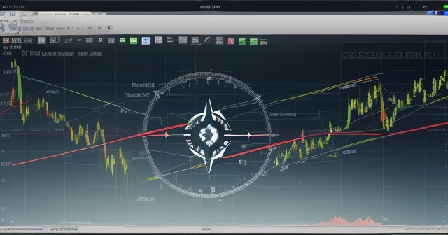
Furthermore, history shows that many Death Crosses, despite the alarming signal, have been followed by surprisingly quick, V-shaped recoveries. The market might dip briefly after the cross, but then prices can rebound sharply, leading to the 50 DMA eventually crossing back *above* the 200 DMA relatively quickly (a Golden Cross reversal). This highlights a key characteristic of markets: they are dynamic, and patterns don’t guarantee outcomes. The Death Cross tells us about the *past* relationship of moving averages; it doesn’t perfectly predict the *future* price movement.
Reclaiming the 200 DMA: A Potential Bullish Catalyst
If the Death Cross represents a potential shift to bearish momentum, what happens when the S&P 500 moves in the opposite direction, specifically when its price reclaims or pushes decisively above the 200-day moving average? This action is often viewed as a potentially significant bullish signal, carrying substantial weight in technical analysis.
When the S&P 500 has been trading below its 200 DMA – perhaps during a correction or a bearish phase – and then manages to climb back above this key level, it suggests that buying pressure is overcoming the previous long-term selling dominance. This move can signal a potential end to the prior correction or downtrend and the possible beginning of a new uptrend. Why? Because the market has now, on average, regained ground lost over the past 200 days, indicating a fundamental shift in short-to-intermediate term momentum that is powerful enough to overcome the long-term bearish bias.
Think of the 200 DMA as a major psychological and technical barrier. When prices are below it, it acts as resistance – a ceiling where selling is likely to emerge. Breaking above it requires significant buying strength and conviction. A decisive move above the 200 DMA, especially when accompanied by other positive technical signals, can confirm a potential trend change and provide a bullish “tailwind.” It tells us that the path of least resistance might be shifting back towards the upside.
This reclaimed level can then potentially flip roles and act as support – a floor where buyers step in if prices pull back. Successful tests and bounces off the 200 DMA from above further reinforce its significance as a strong level of support and strengthen the bullish case. This interaction with the 200 DMA is a key focus for traders and investors looking for confirmation of market reversals or the continuation of strong trends.
The 200 DMA as a Dynamic Support and Resistance Level
Moving averages, particularly the 200 DMA for major indices like the S&P 500, frequently act as dynamic levels of support and resistance. Unlike fixed horizontal lines drawn on a chart, moving averages adapt to the changing price environment, making them more responsive to market dynamics.
When the S&P 500 price is trading above its 200 DMA, the 200 DMA often serves as a potential support level. If the price pulls back during an uptrend, traders watch to see if it bounces off the 200 DMA. A bounce suggests that buyers are stepping in at this historically significant level, confirming the strength of the underlying trend. A break below the 200 DMA while trading above it, however, can signal a potential shift in momentum or a deeper correction.
Conversely, when the S&P 500 price is trading below its 200 DMA, the 200 DMA typically acts as a resistance level. During a bear market rally or a correction bounce, the price may struggle to climb back above this line. A failure to break decisively above the 200 DMA, often accompanied by selling pressure at that level, reinforces the bearish trend. A successful breakout above the 200 DMA from below, as discussed earlier, is therefore a powerful signal precisely because it involves overcoming this significant resistance barrier.
The strength of the support or resistance offered by the 200 DMA is often related to how it has acted in the past. If the S&P 500 has repeatedly bounced off it or been rejected by it, its significance as a level is amplified. Traders look for confirmation – do prices consolidate near the MA before breaking? Does volume increase on a breakout? These details add confidence to the signal provided by the moving average interaction.
Understanding this dual nature of the 200 DMA – acting as support when above, and resistance when below – is vital for anticipating potential price reactions and managing risk around this key level. It’s not an exact science, but it provides a statistically relevant zone where market forces are likely to contend.
Beyond the Moving Averages: Complementary Technical Signals
While the 200 DMA and its relationship with the 50 DMA are powerful, a robust technical analysis approach never relies on a single indicator. To build a high-conviction trading or investment thesis, we must look for confluence – multiple technical signals pointing in the same direction. When analyzing the S&P 500’s potential trend change around the 200 DMA, what other signals should we look for?
- Price Structure: A fundamental concept in technical analysis is the formation of higher highs and higher lows in an uptrend, and lower highs and lower lows in a downtrend. If the S&P 500 is attempting to reclaim its 200 DMA after a decline, look for the price to establish a “higher low” – a low point that is higher than the previous low. This indicates that sellers are losing conviction at higher prices and buyers are stepping in sooner. Follow this with a “higher high” – breaking above the previous peak – and you have the basic building blocks of an emerging bullish trend, supporting a move above the 200 DMA.
- Shorter-Term Moving Averages: Observe how the S&P 500 interacts with its 10-day and 20-day Exponential Moving Averages (EMAs) or 20-day Simple Moving Average (SMA). A sustained move above these shorter-term MAs signals improving short-term momentum, which is necessary to eventually challenge the longer-term 50 DMA and 200 DMA. Crosses of the 10 EMA above the 20 EMA/SMA are bullish signs of accelerating upward momentum.
- Downtrend Line Breaks: During a correction or downtrend, prices often follow a descending trendline connecting a series of lower highs. A break above this downtrend line suggests that the selling pressure that defined the trend is weakening and buyers are gaining control, paving the way for a potential move towards or above the 200 DMA resistance.
- Volume Analysis: Is a potential breakout above the 200 DMA happening on high volume? Increasing volume accompanying a price move suggests stronger conviction behind that move. High volume on a breakout is generally more convincing than a low-volume move, which could be a ‘fakeout’. Similarly, declining volume during a selloff might indicate seller exhaustion.
- Market Sentiment Indicators: Tools like the Cboe Volatility Index (VIX), sometimes called the “fear index,” can provide insights into market sentiment. High VIX levels indicate high fear and uncertainty, often seen during bottoms or sharp selloffs. A decline in the VIX as the S&P 500 rallies towards the 200 DMA can signal easing panic and increasing confidence.
By observing these additional signals in conjunction with the S&P 500’s interaction with its 200 DMA, you can build a more robust picture of the market’s underlying health and the probability of a sustained trend change. One indicator alone is a piece of information; multiple confirming indicators provide conviction.
Market Capitulation and V-Shaped Recoveries
We touched upon the historical tendency for the worst of a decline to occur *before* a Death Cross is confirmed. This brings us to the concept of market capitulation. Capitulation is typically the final phase of a market selloff, characterized by intense, indiscriminate selling driven by panic and despair. Investors throw in the towel, selling assets regardless of fundamental value, just to stop the pain. This often results in a rapid and dramatic price drop over a short period.
Identifying signs of potential capitulation is important because it suggests that the majority of sellers have been flushed out of the market. If there are few sellers left, even modest buying can cause prices to rebound sharply. This is why periods of capitulation are sometimes followed by swift, V-shaped recoveries – the price drops precipitously (the left side of the V) but then bounces back just as quickly (the right side of the V) because the selling pressure is exhausted and buyers step into the vacuum.
While challenging to pinpoint precisely in real-time, signs of capitulation might include:
- Spikes in trading volume, especially on down days.
- Extreme readings on sentiment indicators (e.g., very low investor confidence surveys).
- Massive outflows from equity funds.
- Sharp, sudden drops in price that reverse quickly.
- “Throwing in the towel” commentary from market participants and media.
When considering the S&P 500’s position relative to the 200 DMA during a downtrend, if we see signs of potential capitulation *before* a Death Cross forms, it can add weight to the argument that the market might be due for a V-shaped bounce rather than a prolonged, grinding bear market. This doesn’t invalidate the bearish signal of the Death Cross itself, but it offers context and suggests that the *nature* of the ensuing price action might be a quick recovery rather than a slow bleed. Conversely, if the Death Cross occurs *without* clear signs of prior capitulation, the risk of further decline might be higher.
Scenarios at the 200 DMA: Bullish Breakout vs. Bearish Rejection
The S&P 500’s interaction with its 200-day moving average often presents a critical juncture, a moment of truth where the market’s next significant move can be determined. As traders and investors, our role is to analyze the probabilities of different scenarios playing out at this key technical level.
Scenario 1: The Bullish Breakout
This scenario unfolds when the S&P 500, trading below its 200 DMA, manages to climb above it. For this to be considered a convincing bullish breakout, we would typically look for:
- A decisive move *above* the 200 DMA, not just a brief touch or penetration. A strong closing price above the average is important.
- Sustained trading *above* the 200 DMA for several days or even weeks, confirming that the move wasn’t a ‘fakeout’.
- The 200 DMA potentially flipping roles and acting as support on any subsequent retests or pullbacks.
- Confirmation from other technical indicators, such as improving price structure (higher lows and higher highs), shorter-term moving averages crossing above longer-term ones (like the 50 DMA crossing above the 200 DMA – a Golden Cross), and potentially increasing volume on the breakout move.
If this bullish scenario materializes, it suggests that the previous bearish momentum has likely ended, and the market is entering a new phase where the path of least resistance is upward. This could justify increasing equity exposure or adopting a more aggressive trading stance.
Scenario 2: The Bearish Rejection
This scenario occurs when the S&P 500 approaches the 200 DMA from below, touches it, and then fails to break through, reversing course and moving back down. This is a classic case of the 200 DMA acting as resistance. Signs of bearish rejection include:
- The price stalling or consolidating at or just below the 200 DMA.
- Failure to achieve a decisive close above the 200 DMA.
- A clear reversal pattern forming near the 200 DMA (e.g., a bearish engulfing candle or a double top on shorter timeframes).
- Prices subsequently breaking below recent support levels, particularly the most recent higher low if one had formed.
A confirmed bearish rejection at the 200 DMA suggests that the long-term selling pressure is still dominant, and the market is likely to continue its prior downtrend or enter another significant wave of selling. This scenario would warrant caution, potentially reducing equity exposure or seeking short opportunities.
Monitoring how the S&P 500 interacts with the 200 DMA, and using other technical signals for confirmation, helps us assess which of these scenarios is more probable. It’s a critical point of analysis for market participants.
Cross-Asset Correlation: The S&P 500 and Bitcoin Example
Interestingly, the technical picture of major equity indices like the S&P 500 can have implications for other asset classes, including cryptocurrencies like Bitcoin (BTC). While seemingly disparate, in recent years, the correlation between the S&P 500 and Bitcoin has often been positive, meaning they tend to move in the same general direction.
Why might this be the case? Factors include:
- Risk Sentiment: Both equities (especially growth stocks, which influence the S&P 500) and Bitcoin are often perceived as risk-on assets. When overall market sentiment is positive and investors are willing to take on more risk, both tend to perform well. When risk aversion increases, both may sell off.
- Macroeconomic Environment: Global liquidity, interest rates, and inflation concerns impact both traditional markets and crypto.
- Institutional Adoption: As institutional investors increasingly allocate capital to both areas, their decision-making processes (which often involve assessing macro conditions and technical levels) can lead to correlated movements.
Given this correlation, a significant technical breakout in the S&P 500, such as a decisive move above its 200-day moving average, can provide a “tailwind” for other correlated risk assets. If the S&P 500 successfully reclaims this key long-term trend indicator, it can improve overall market sentiment, reduce fear, and encourage broader investment into perceived riskier assets. We have seen instances where Bitcoin’s price action has mirrored significant moves in the S&P 500, including interactions with its own 200 DMA or other key technical levels.
Therefore, even if your primary focus is on assets like Bitcoin, keeping a close eye on the technical posture of the S&P 500, particularly its relationship with the 200 DMA, can provide valuable context and potentially offer leading or confirming signals for your trades. It’s a reminder that markets are interconnected, and analyzing major indices can offer clues about the broader investment landscape.
Navigating External Factors and Adaptability
Technical analysis, including the use of the 200 DMA, provides a framework for understanding market dynamics based on price and volume history. However, markets do not exist in a vacuum. External factors – such as macroeconomic news, geopolitical events, and policy decisions – can rapidly override technical signals, at least in the short term.
Consider, for instance, sudden news regarding tariffs or international trade negotiations. Such events can trigger rapid shifts in market sentiment and force price action that deviates sharply from what technical indicators might suggest. A market poised for a technical breakout above the 200 DMA could be knocked back below it by negative news, while a market struggling below the 200 DMA could receive a boost from positive developments.
This is where the art of trading and investing meets the science of technical analysis. While we use tools like the 200 DMA to assess probabilities and identify potential turning points, we must remain adaptable and aware of the broader market environment. Technical levels like the 200 DMA provide context, but they don’t predict the news. Therefore, it’s crucial to:
- Stay informed about key economic releases and major global events.
- Understand that unexpected news can cause volatility and potentially invalidate technical setups.
- Use risk management tools, such as stop-loss orders, to protect capital in case a technical signal fails to follow through due to external shocks.
- Be prepared to reassess your technical analysis in light of significant fundamental developments.
The 200 DMA remains a powerful indicator because it reflects the market’s *response* to all factors – technical, fundamental, and psychological – over a long period. But its interaction with price is a dynamic process, not a static rule. Your ability to combine technical insights with an awareness of external influences will significantly enhance your market navigation skills.
Building Your Strategy Around the 200 DMA
So, how can you integrate the S&P 500’s 200 DMA into your own trading or investment strategy? Remember, it’s a long-term indicator, best suited for identifying the primary trend and potential major turning points, rather than predicting day-to-day fluctuations.
Here are some ways investors and traders might use the 200 DMA:
- Trend Identification: Use the S&P 500’s position relative to the 200 DMA to determine the prevailing long-term trend. If above, favor long positions or maintain existing ones. If below, favor caution, consider short positions, or reduce equity exposure.
- Entry Signals: A convincing breakout above the 200 DMA after a period below it can serve as a potential entry signal for long positions, particularly when confirmed by other indicators. Similarly, a break below the 200 DMA from above could signal a potential exit point or a signal to initiate short positions.
- Exit Signals: If you are in a long position during an uptrend, a break below the 200 DMA might act as a warning signal to consider reducing exposure or exiting the position, especially if confirmed by other bearish signs.
- Risk Management: Use the 200 DMA as a potential level for setting stop-loss orders. For long positions initiated during an uptrend, a stop could be placed just below the 200 DMA, as a break below it might signal a trend change.
- Confirmation: Always seek confirmation from other indicators – price structure, volume, shorter-term MAs, momentum oscillators. The more signals that align with the message from the 200 DMA, the higher the conviction in the potential move.
It’s important to define your own rules based on the signals the 200 DMA provides. Will you only invest in the S&P 500 (or correlated assets) when it’s above the 200 DMA? Will you use a Death Cross as a signal to move to cash or hedge your portfolio? Or will you view it as a potential capitulation signal for a V-shaped bounce? Your strategy will depend on your investment horizon, risk tolerance, and overall market philosophy.
Conclusion: The 200 DMA as Your Guide, Not a Guarantee
The S&P 500’s 200-day moving average is undoubtedly one of the most powerful and widely watched technical indicators for assessing long-term market trends. It acts as a dynamic line in the sand, separating potential bullish phases from bearish ones, and serving as a critical level of support and resistance.
We’ve explored how its relationship with the 50 DMA gives rise to signals like the Death Cross – a pattern that, while historically significant, doesn’t always lead to immediate, prolonged declines and has sometimes preceded swift recoveries, particularly in the presence of capitulation. We’ve also seen how reclaiming the 200 DMA after a downturn can act as a potent bullish catalyst, suggesting a potential trend reversal supported by improving price structure and momentum.
However, remember that no single indicator is infallible. The 200 DMA provides a framework for probability, not a guarantee of future price action. It must be used in conjunction with other technical analysis tools and a keen awareness of the broader market environment and potential fundamental catalysts. Your ability to interpret the signals from the 200 DMA within this wider context, coupled with diligent risk management, will be key to navigating the market successfully.
So, as you continue your journey through the financial markets, keep a close watch on the S&P 500 and its interaction with this pivotal line. Let the 200-day moving average be your guide for understanding the long-term currents, but always stay adaptable, informed, and ready to adjust your course as new information emerges. The markets are constantly teaching us, and mastering the language of indicators like the 200 DMA is a vital step in becoming a more skilled and confident investor.
s&p 500 200 dmaFAQ
Q:What is the significance of the 200 DMA in trading?
A:The 200 DMA serves as a long-term trend indicator, helping traders assess overall market momentum and identify potential support or resistance levels.
Q:How can I use the 200 DMA in my trading strategy?
A:Traders can use the 200 DMA for trend identification, entry signals, exit signals, and risk management in their trading strategies.
Q:What does it mean when the price is below the 200 DMA?
A:When the price is below the 200 DMA, it typically indicates a bearish long-term trend, suggesting sustained selling pressure in the market.
You may also like
Calendar
| 一 | 二 | 三 | 四 | 五 | 六 | 日 |
|---|---|---|---|---|---|---|
| 1 | 2 | 3 | 4 | 5 | 6 | 7 |
| 8 | 9 | 10 | 11 | 12 | 13 | 14 |
| 15 | 16 | 17 | 18 | 19 | 20 | 21 |
| 22 | 23 | 24 | 25 | 26 | 27 | 28 |
| 29 | 30 | 31 | ||||
發佈留言
很抱歉,必須登入網站才能發佈留言。